Vlad Todirut
Product Designer
Know what
you sign.
Is it safe?
Signing transactions in web3 can be scary.
You're about to confirm something, but all you see is a wall of code, random hashes, or some vague text like "contract interaction".

Most people (including me sometimes) just cross their fingers and hit sign, hoping nothing bad happens. But one bad signature and your wallet might be emptied in seconds. Not great.
After talking to users (more on that below), it became pretty clear this wasn't just my own paranoia.
I first ran into this issue when I designed MetaMask 10 years ago. Back then, just making it work was already a win. But now, with Taho, I had the chance to take another stab at this mess and try to make signing feel a bit more human. Or at least less terrifying.
It's not.
Make it clear
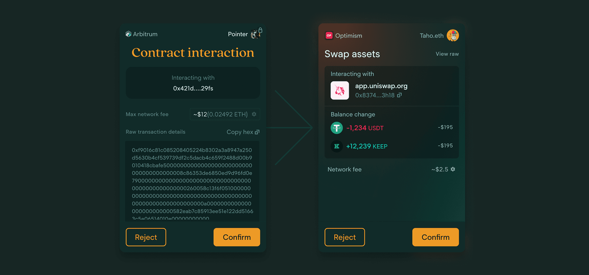
1. Make it human-readable
No more hex dumps or mystery contract interactions. Show people what they’re actually signing in plain language, whenever possible.
2. Surface the real risks
Instead of just showing scary hashes, highlight what might happen if they sign. Are they giving unlimited access? Approving tokens? Signing something weird? Tell them.
3. Reduce blind trust
Help users verify who they’re interacting with. Show contract names, known protocols, and anything that helps them connect the dots.
4. Keep it simple (but not dumb)
We didn’t want to drown users in technical details, but we also didn’t want to oversimplify things to the point of uselessness. The goal was: helpful, not patronizing.
5. Make it consistent
The signing experience should feel familiar across transaction types. No surprises if you're swapping tokens, staking, or minting NFTs.
With these principles in mind, it was time to open Figma and start exploring.
Make it clear & Consistent
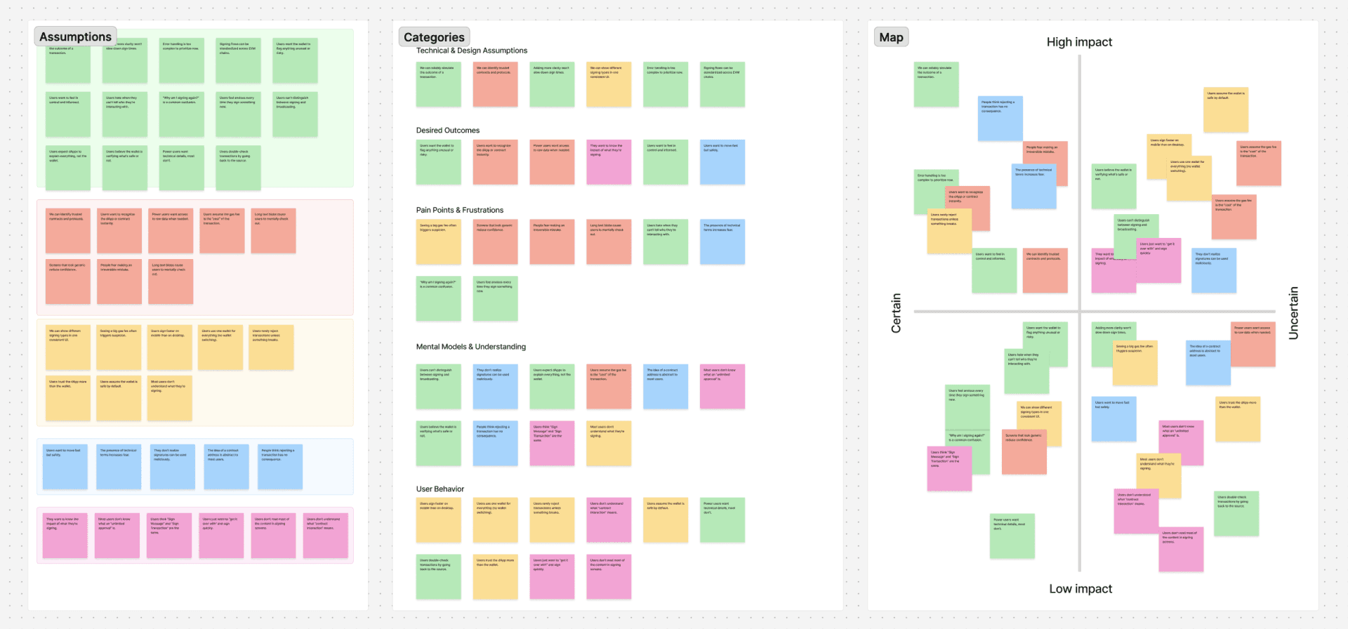
Now that we knew what users needed (and what was technically possible), it was time to start actually designing. I started with a bunch of lo-fi wireframes, exploring different ways to structure the information: hierarchies, transaction details, progressive disclosure... all the good stuff.
The goal here was to go wide first. I wanted to generate enough options that we could review, discuss, and pick apart as a team before committing to any direction. Wireframing at this stage also helped us focus on the flow and content hierarchy without getting distracted

One of the ideas I explored was a multi-step signing process. It was an intriguing direction because it allowed us to give users more clarity without overwhelming them with too much information upfront. Progressive disclosure is usually a pretty solid principle in this kind of complex flow.
But after some testing and team discussions, it became clear that this approach introduced too much friction. Users wanted to feel safe, but they also wanted to move quickly. Adding 2 or 3 steps to every signature slowed things down more than it helped. So while the idea had some good theory behind it, it didn’t fit our real-world use case.
Testing also validated our information architecture, users priorities when signing were:
1. What am i signing
2. With who am i signing with
3. How is this affecting my wallet
A surprising side-note here would be that many users didn't care that much about network fee, especially when interacting with L2 chains.
DESIGNING THE SOLUTION
Build it.
After reaching a conclusion on what we could built, what the users wanted and what helped our business goals, it was time to turn the wireframes into designs. Using our existing Design System, I built out a modular framework for the Sign TX screens. This allowed us to scale the patterns easily across different transaction types while keeping things consistent for users and engineers.
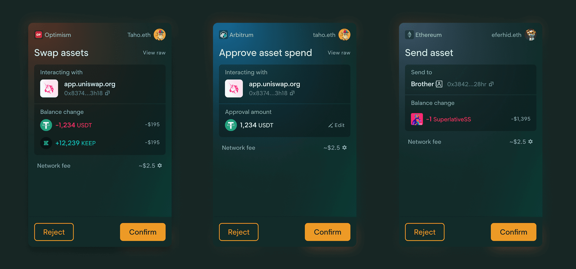
Each screen would have the following components, making is easy for users to scan.
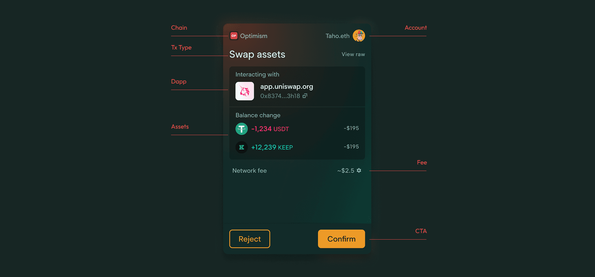
I created a set of molecules to easily build up any variation of a sign transaction page that you would need. From Sign Message, to approve and multi token LP-ing. This provided a clear path for any designer that wanted to incorporate a specific SignTX screen in a flow, but more importantly it gave the engineering team a blue-print on how to build out the components.

RESULTS
What did we measure
Before we started designing, we ran some light benchmarking to get a sense of where we were starting from and how we might measure success later on.
We looked at:
Time to sign: On average, users took around 30 seconds to sign a transaction.
Rejected transactions: Around 35% of transactions were rejected. When we asked users about this, many told us they often rejected a transaction just to double-check things on the dApp side, since they didn’t fully trust what the wallet was showing.
This gave us a few useful metrics we could use to check if our redesign actually helped or if we were just moving pixels around for fun.
In the end, we managed to bring signing time down from 30s to 22s and cut rejected transactions by two-thirds. While there's still work to be done, this gave us confidence that our changes made a real difference.
FINAL
FINDINGS
12%
REJECTED TRANSACTIONS
22s
TIME TO SIGN
LEARNINGS
What did we miss
Hats off to the engineering team at Taho — they pulled off a massive lift to make these improvements possible, from adding contract simulations to expanding the design system to support all the new flows.
If there’s one thing I wish we could’ve pushed further, it’s error handling and better warnings. We had the basics, meaning flagged contracts and fake websites, but there is much more that can be done. We had plans for it, but from a technical perspective it would’ve been an extra lift we couldn’t take on at that time. It’s definitely something I’d love to explore more in the next iteration.